Better designs
 We spent a lot of time designing https://browshot.com/ to be simple and easy to use, but not much on this blog and the e-mail we sent to our customers. Web design is not our strong suit, and we have engaged different third parties to help us.
In the past 2 weeks, we have been working hard on integrating MailChimp for better e-mails.
Hopefully you have also noticed that our blog looks much nicer!
Better e-mails
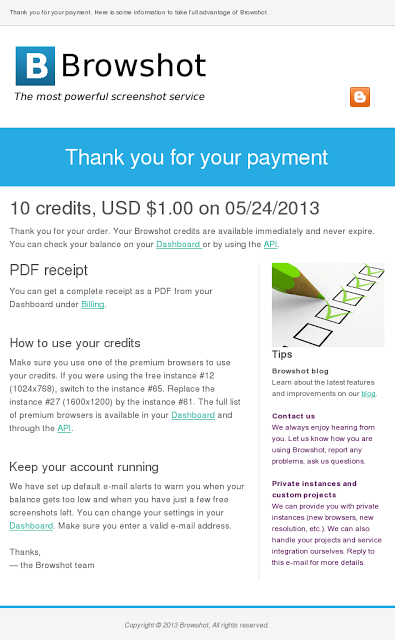
We sent just a few e-mails to our users: payment notifications, e-mail verification for free credits, etc. They were very simple HTML & plain text templates with just the minimum information. We are upgrading them to much nicer templates, and will use this vehicle to convey more useful information.
Here is how the payment receipt e-mail looks now:
 |
| The new payment notification e-mail |
We are still working on the other e-mails.
We will probably keep our e-mail alerts for low balance and few free credits to just plain-text.
First newsletter
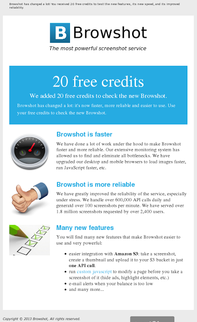
We sent our first newsletter to about 230 of users who opted in and have not used Browshot in a couple of months. We wanted to let them know much Browshot has evolved recently: faster, better reliability and many new great features such as the tight integration with S3.
 |
| Our first newsletter |
I hope you will find our sites easier on the eye, and the e-mail more useful. Please share your comments with us.
